The second in our four-part series on best demonstrated research practices covers items to consider when using graphics in an online survey.
VeraQuest understands the value of fast, inexpensive research in today’s marketing research environment, which is why our system was built with speed and cost in mind. However, we also recognize the critical importance that best-demonstrated practices play in ensuring quality results.
“Will these work?” That’s what we’re often asked by clients who send us images for use in surveys. In most cases, the answer is “not really”. Truth is most images are not ready to be inserted into a survey without some form of manipulation. And while theoretically it should be your supplier’s responsibility to know what works and what doesn’t, theory doesn’t always translate into actuality. Therefore, like all other aspects of research, the more you know the more likely you will be to get accurate, meaningful survey results. The following are some rules of thumb we’ve developed to make sure the images we include in our surveys are displayed the way we want.
High Resolution Images
We typically ask clients to send us images as large as they can (1000 x 1000 is large enough in most cases). Ideally they should be uncompressed (e.g. TIFF format) and have a resolution of 300 dots per inch (DPI). This gives us the greatest flexibility in making sure we can create an image that suits the needs of the study. Unfortunately, our ideal isn’t always feasible; therefore, we can and do work with other formats (e.g. JPG, PNG) and resolutions. The one overarching thought to keep in mind is when it comes to graphic files…size matters; larger is always better.
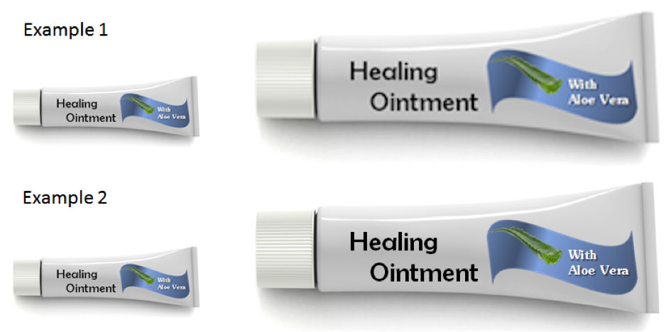
Consider Example 1 below. The tube on the left represents the image supplied by the client. The image is small, but usable if the purpose of the image is to provide the respondent with a visual cue to supplement a text description of the product. This is sometimes the approach used when trying to determine product awareness levels. However, what if the purpose of the study is to test more finite packaging elements, such as the callouts? The image on the left of Example 1 would be too small, with the Aloe Vera callout being barely legible. And if we increase the image size as shown on the right the image starts to become blurry. Now, let’s assume we start with a high resolution image with the specifications outlined earlier. As shown In Example 2 below, we can now resize down to the original smaller size as show on the left, or make a larger version with clear detail as shown on the right. These are the types of images we want respondents reacting to in the survey.

Consistent Angles
When asking respondents to consider a package within a competitive set, all products should be shown at a consistent angle, typically forward-facing. The objective is to avoid having any one product garner greater attention because it’s being presented at an angle while the others are forward-facing. While this seems fairly obvious, we are no longer surprised when we receive images that are inconsistently displayed. The reality is that clients, frequently pressed for time, will grab images that are shot at different angles not thinking about the impact it might have on the survey. In the example below, all products are forward-facing except for Raisin Brain. Now let’s say one of the purposes of the study is to get a read on purchase interest. Let’s also say the survey’s results indicate that purchase interest in Raisin Bran is significantly greater than that of the other products tested. Is it possible that the angle of the box has inadvertently influenced respondents by making them feel the product is “special” somehow? By displaying all products at a consistent angle, we eliminate the possibility that an inadvertent and often over-looked factor will render the survey results worthless.

Sizing Images for Multiple Devices

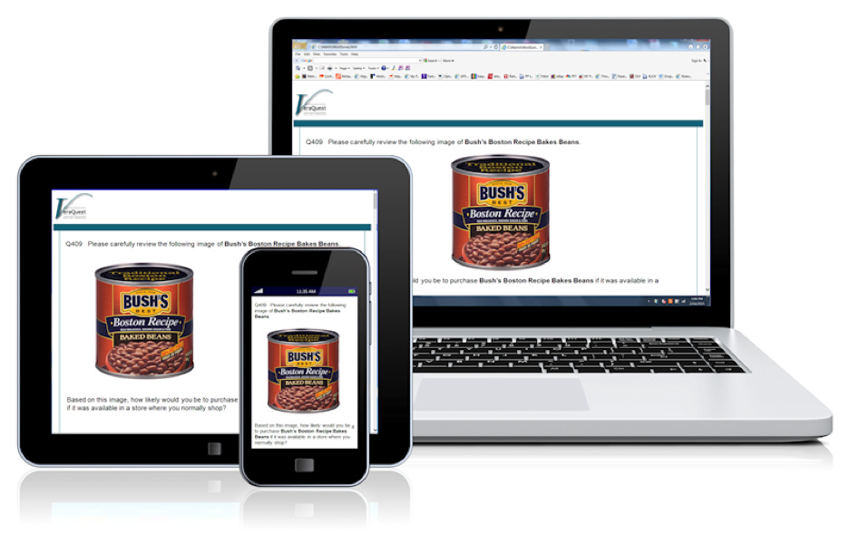
Image size is the area where most images require some form of modification. We might have an image that looks perfect on our laptops, but what about the respondent using a tablet, or better yet a mobile phone? Recently, we did some internal research on research regarding viewing experience by device type. We also tested various image types (tall products, wide products, portfolio shots, products with many callouts, etc.). The following are some guidelines to consider before resizing the original images:
The width of the image is more critical than the height. The ideal scenario is where the question text and the image can be viewed on the screen without any left-to-right or up-and-down scrolling. If there’s a situation where the image needs to be especially tall (an aerosol can with very small text, for example), and resizing down is not an option, at least we know the respondent will be seeing the entire image because they have to scroll down in order to advance to the next screen and are already in the mindset of scrolling down to advance at each question. Now, having an image that is particularly wide (product portfolio images come to mind), creates a separate issue. We know that respondents have to scroll down in order to click to the next screen, but respondents have nothing that forces them to look further right. This leads to only part of the package being viewed or in the case of a portfolio image, some of the products not being viewed at all. As a rule of thumb we try to resize images to a maximum of 700 pixels wide. That said, we’ve gone as far as 900 pixels wide depending on the size of the text on the packaging; however, anything wider than that increases the risk the image will not be completely shown. Fortunately, in most cases 700 pixels wide is plenty, and in the case of portfolio images, workarounds such as breaking the products into two stacked rows instead of one long row works if needed.
With mobile phones, don’t be so quick to dismiss larger images. When sizing an image for use on a mobile phone, the natural inclination is to simply shrink the image small enough so that it can be viewed without scrolling or the need to make it larger via the touch-screen. But what happens when the text on the packaging gets too small to read? The respondent is going to use the touch screen to make it larger, but what they will see is a blurry image like the one shown in Example 1 from earlier in this post. People are so used to using the touch screen controls at this point, that shrinking a larger image down themselves is virtually instinctive. So now, they have the benefit of a larger image to view legible text, but also the ability to shrink the image down in order to see the entirety of the image.
Final Thoughts
While I have outlined some of the general rules and guidelines we use when preparing graphics for a survey, none of them are etched in stone. One thing, however, that doesn’t change is the final evaluation of an image before it gets added to the survey. Before we send images to our survey programmers, we place the images into a temporary mock survey, and view the survey on a PC, tablet and mobile phone. We then view the images with one primary question in mind…is there anything about these images that might cause us to question the findings of the research? Is the text blurry and/or illegible? Is the key callout on the far right of a very wide image? Is one package on a shelf image set at a different angle than all the others? By following a few basic rules, you can present images in such a way that the images serve only to contribute to the accuracy of the survey rather than undermining it.
Leave a Reply